HCI Research — 2023
Mobile App
Reduce Food Waste
Company
Self
My Role
UI/UX Designer
Timeline
2 months
Responsibilities
UI Design
UX Research
Design system
Overview
We are a group of MSc HCI students, here to design and present a software solution to tackle the real-world issue of climate change. Climate change is real. And one question that individuals pose to themselves is: what can we really do about it? Our efforts are too insignificant!
Guardians of Food is a design attempt by us to provide a solution for the given Design Challenge to help and encourage individuals to make a difference in addressing climate change.
Side Note
This is a complete UX case study, with all our research and findings, it might be a bit too long, but I wanted a case study which showed my whole design process in detail, so here it is. Hope you like it!
Objectives
01
Empower Users
Design an innovative solution focused at reduce food waste and enhance pantry management, empower users to track, organise, and efficiently utilise their food inventory.
02
Valuable Insights
Foster sustainable consumption habits, minimise unnecessary food disposal, and provide users with valuable insights to make informed decisions about meal planning and grocery shopping.
The Problem
Food Waste refers to any food products that are thrown away as opposed to being consumed. While there are many provisions in place to reduce food waste, the UK produces the highest amount of food waste in Europe. Around 9.5 million tonnes of food UK throws away food waste in a single year – even though 8.4 million people in the UK are in food poverty.
Recent studies shows, an average food waste per household per day in the UK Households throw away 1.96kg of food per day, on average.

Design Process
We followed the User-Centred Design (UCD) process, in which we focussed on users and their needs in each phase of the design process. The findings from our research helped us in understanding the gaps in the market and potential opportunities for improvement and innovation.
The Design Thinking approach to structure our process has following stages:

Empathize Phase
We delved into market research, conducted user surveys and interviews, and formulated competitive analysis to unearth insights that guided our design journey and helped us understand key insights.
Quantitative Research
In the initial phase of the project, we conducted two thorough users surveys to assess the food and lifestyle of users and identify the potential user base for our app.
First survey was conducted to understand eating and budgeting habits of users. Later, second survey was conducted to analysis how much food wastage occurs in households at the consumer level.

Insights
Managing Expired Food
Less awareness about what should be the right way to handle the expired food items.Food Expiration Reminders
Need frequent reminders related to what all food items are nearing their expiration date, so that they can be utilized before they go bad.Shopping List Tracking
A convenient method required to sync the kitchen pantry with the shopping list for efficiency during grocery shopping.Customized Recipe Suggestions
Quick, easy to make recipe suggestions based on available food items at home.Food Donation Awareness
Knowledge about nearby donation centres or related communities to donate food.
We did a market research based on our problem area in order to understand what other competitors are there. 5 different types of applications were discovered which help users manage their kitchen in various ways.

Define Phase
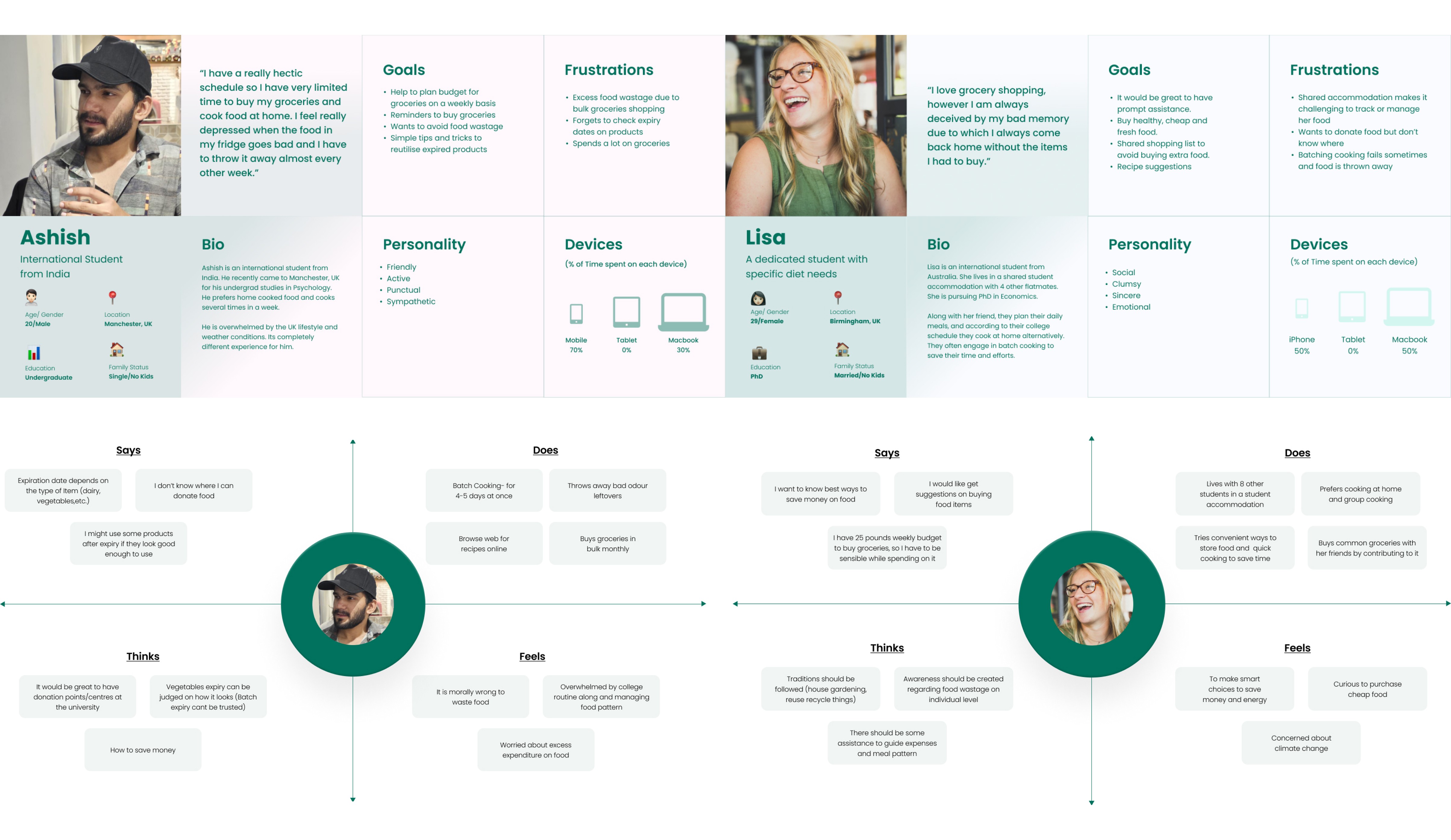
We brainstormed few ideas and selected one of them, as others had few setbacks. Based on the data collected, we crafted empathy maps & user personas to ensure that the app is user-centric and aligns with the goals of the users.
Solution
A comprehensive mobile application that efficiently manages grocery inventory, pro-actively reminds users of expiry dates, and offers features such as recipe suggestions and analytics to minimize both environmental impact and unnecessary expenses due to food wastage.
Up to 50%
of household food waste can be reduced through the implementation of effective food storage practices.
Approximately £200
annually on groceries could be saved by an average UK household by consuming food before expiration.
Estimated 2.5 million tonnes
of food waste, globally, could be prevented yearly if food were consumed before expiration by all UK households.
Ideate Phase
We shaped the app’s core elements by creating user flows, designing the app’s information architecture, and visualising user interactions in a sequential narrative format using storyboarding.
User Flows
We brainstormed user flows on a whiteboard which involved mapping out step-by-step user interactions visually, fostering collaboration and ideation among team members. It provided us a space for dynamic exploration, quick adjustments, and collective input in refining the user journey for optimal usability.

Information Architecture
We accumulated our thoughts on a whiteboard for the information architecture, before proceeding with it’s final design flow. Our focus lay on organising and structuring information to ensure user-friendly, intuitive navigation, and easy access for users.

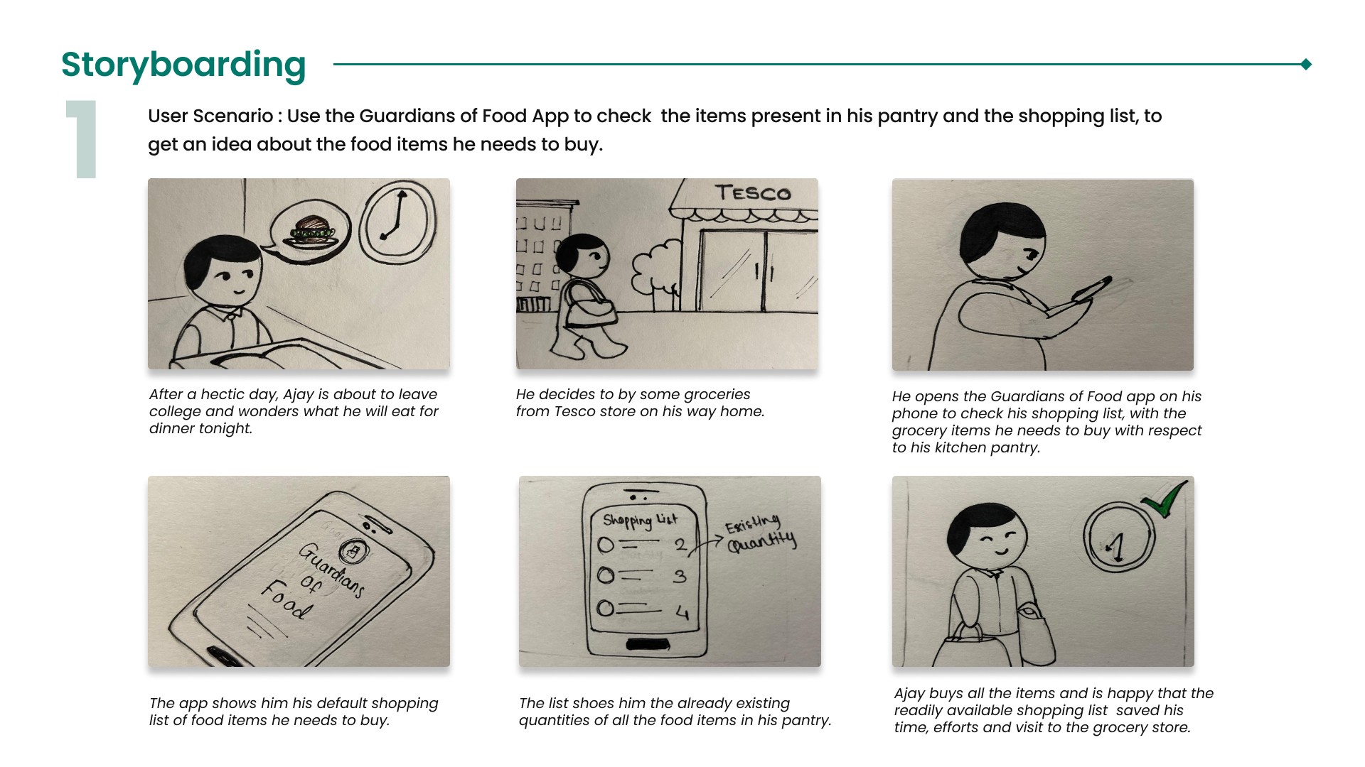
Storyboarding
We accumulated our thoughts on a whiteboard for the information architecture, before proceeding with it’s final design flow. Our focus lay on organising and structuring information to ensure user-friendly, intuitive navigation, and easy access for users.

Design Phase
We crafted wireframes digitally, followed by low-fidelity design. Further we decided a visual identity, and transitioned them into Hi-Fidelity designs.
Wireframes
They are most essential to narrowing down on the design ideas and figuring out the initial rough idea. These are few of the wireframes we made:

Low-Fidelity Designs
After finishing the wireframes, these Lo-fidelity designs helped us finalise the Visual identity and the final structure of the app. We looked at competitor apps and various modern, clean UIs as inspiration.

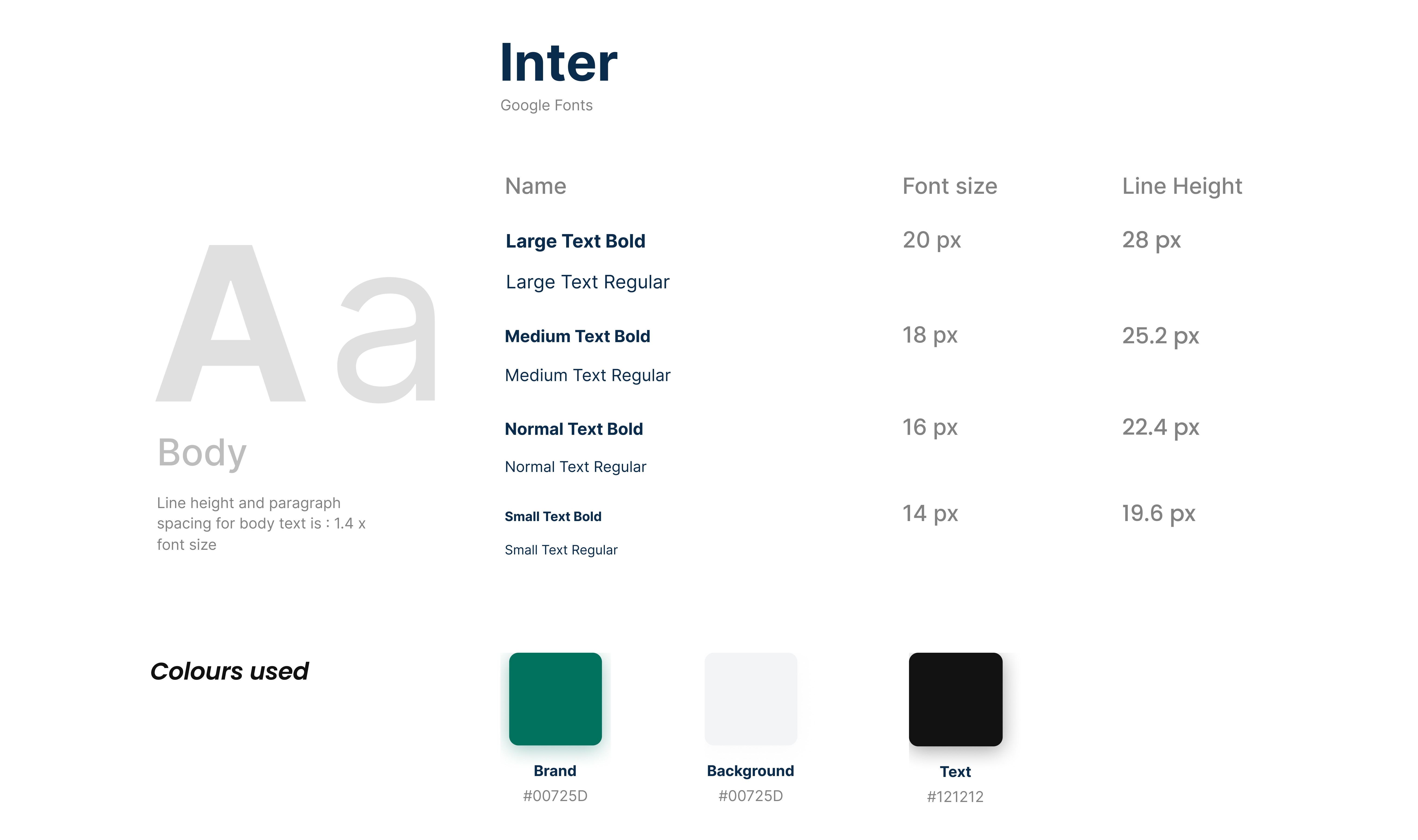
Visual Identity
We choose Inter as the font for our app. Few reasons why we choose this font are:
1. Readability
2. Versatility
3. International Appeal
4. Modern Aesthetic
5. Accessibility
6. Consistency
Considering the fact that this app would be used by a diverse set of users from all over the globe, a font
which is versatile, accessible, and aesthetic is important to us.
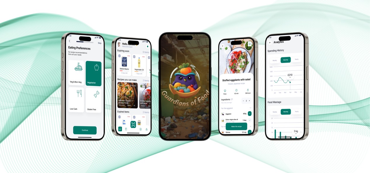
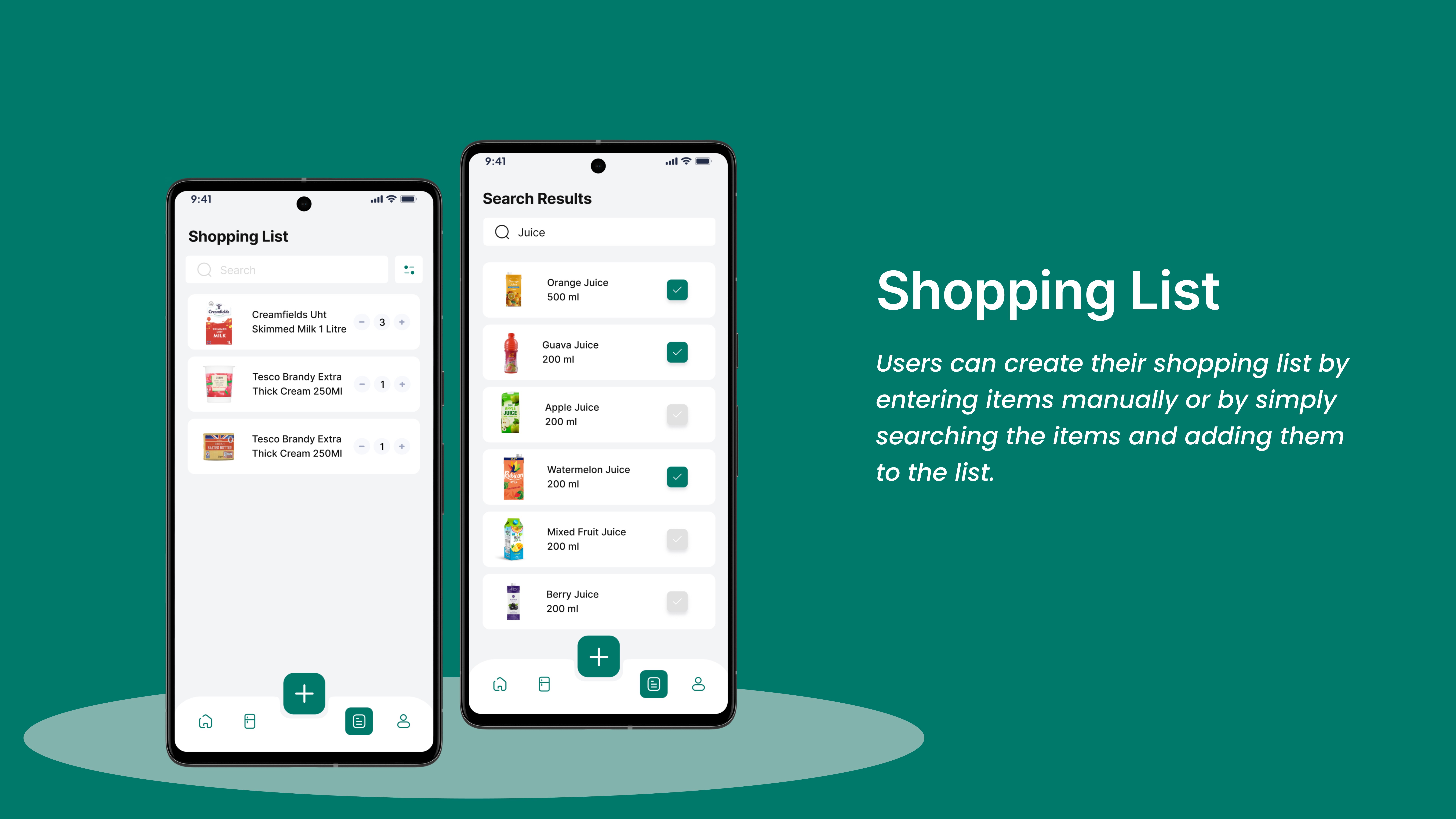
Hi-fidelity Designs
And now, the final output! After weeks of rigorous research and endless discussions, this is what we made.


Testing and Iteration
To take a run through over our design, we carried out usability testing with the users. This helped us achieve some valuable insights for the design, which were later implemented for better UX.
Usability Testing
We conducted usability testing involving 4 potential users to evaluate the user interface and assess how usable, intuitive and easy to use the design was. This helped us get actionable insights and to improve the user experience of the mobile app.
Testing Goals
Test Onboarding flow
Test Scan the items flow
Test the My Kitchen flow and identify the errors
Test Shopping list flow
Test the Recipe Suggestion View flow
Find out whether users naturally understood the purpose of the app without giving any context : i.e. icons, typo, and others.
Testing Method
> Moderated usability testing sessions: in-person (4 sessions), using Figma’s prototyping tool.
> Google Docs was used to create the testing script and note taking. Google Sheets was used to organise the screener, analyse notes, and note testing results.

Design Iteration
Upon several UI iterations, we made major changes to our initial home screen design:
1. Replaced categorisation with an Expiring Soon section, since we realised that it is more important.
2. We got rid of the search bar since it wasn’t required.
3. Changed the colour scheme since the green we initially used was harsh on the eye and less aesthetic.
4. Laid more emphasis on the scan item button at the bottom, since it would be the most used section.
5. Replaced the Mascot next to the search bar with a profile icon since it increases the usability of the button and gives us more white space.

Key Learnings
Noting down all the ideas and suggestions that we had during all our meetings and discussions, ended up being quite useful for us as we did not have to rely solely on our memory.
We learnt that trusting our own intuition and visual judgement is also important.
Sometimes, a design might feel right even if it doesn’t strictly follow guidelines.
Finding the right balance between principles and intuitions can lead to unique and effective solutions.
While working on the project, we enjoyed most of the processes as each of those offered a different perspective on our approach towards problem solving.
But one of the things that we could have done better was to dismiss some of the processes which were not working for us early in time, so as to not waste both time and efforts.
We concluded that not every process works well for all problem statements and teams.

Next Project
Luxury Ride
Mobile App
Take me back